|
|
Google we have to talk
Google we have to talk
Your interface language over the last 12 - 18 months stinks
Simple
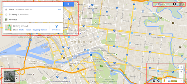
Look at this - 4 get this - 4 points of controls for google maps (yep I have highlighted them in red) I often switch back to the old interface and write abusive things in the notes to google because it is just plain wrong!!

Would for example you do this with a car dash board? Split all the controls over 4 main focus points - Of course not! How about the control system of a jet plane? NO YOU WOULD NOT!
We want all the functionality in one focus space guys not 4!
This is just one example of a so called trend that I have seen implemented in the back end of google Mail admin and a few other places.
It makes my blood boil with rage - how can they take an amazing product like maps and to that to the interface?
Not happy!
END RANT

|
|
 Welcome to...
  Welcome to...